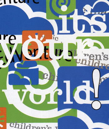
Wolfgang Weingart was one of the most influencial designers to make a journey into the New Wave movement. He envisioned a more experimental and expressive style of typography.
The three main disciples Weingart admired when he started practicing New Wave were Dan Friedman, April Greiman and Willi Kunz. Their work was so admired and imitated that it was the basis of the "New Wave" typography in the 1970's and 1980's. The Characteristics of this anti-movement were letter spaced Sans Serif type, stair-step rules, diagonal type, dynamic use of space, the use of weight changes or italics within words and reversed type.
David Carson is an American graphic designer who is best known for his unique magazine designs and use of experiemtanl tyogrpahy. Carson spent his early adulthood as a professional surfer and attained a standing in the world surfing chamionships while he worked as a high school teacher in California.
David Carson and his work have been recognized world wide and featured in over 180 magazines and newspaper articles. His work has proved popular with a number of people such as feautures in the Newsweek magazine where David has produced many designs.
 |
| David Carson |
Ray Gun was an American alternative rock-and-roll magazine, first published in 1992 in Santa Monica, California. Led by founding art director David Carson, Ray Gun explored experimental magazine typographic design. The result was a chaotic, abstract style, not always readable, but distinctive in appearance. That tradition for compelling visuals continued even after Carson left the magazine after three years; he was followed by a series of art directors, including Robert Hales, Chris Ashworth, Scott Denton-Cardew, and Jerome Curchod.
David Carson is an American graphic designer. He is best known for his innovative magazine design, and use of experimental typography. He was the art director for the magazine RayGun. Carson was perhaps the most influential graphic designer of the 1990s. In particular, his widely imitated aesthetic defined the so-called "grunge typography" era.
"Grunge Typography" is a unique style of typography that makes words stand out. David Carson provides pieces with a grunge edge and retro touch, typically with big fonts, straight lines, round curves, dark colours and grunge textures.
 I
love the style of "Grunge Typography" due to the texture of the work
and the rough, dark essence of the posters. I love the use of ink
splatters and the texture of the paper in the image above. im not into
typography as i dont like the use of text in pieces of work however I
would love to incorparate texture to my own photos like that of the ink
splats and the rough paper. however fashion photography is my way
forward rather than typography.
DAVISD CARSON (1952-)

David Carson is principal and chief designer of David Carson
Design, Inc. with offices in New York City and Charleston, SC.
Carson graduated with "honors and distinction" from San
Diego state university, where he received a BFA degree in
sociology.
David Carson is a graphic designer and magazine publisher,
whose most prominent projects include the music magazine “Ray Gun,” and
his first book “The End of Print: The Graphic Design of David Carson.”David was born in Texas on September 8th, 1955. For much of his early adulthood David was a professional surfer, and attained a standing in the World Surfing Championships while he worked as a high school teacher in California. While his early life had very little if anything to do with graphic design, this changed drastically when he enrolled in a short commercial design class, where his first design influences occurred, stemming from his instructor: a Swiss designer named Hans-Rudolph Lutz (Sacharoq, 1996, p.8). His new found passion for the arts led him to enrol full time in design school, and shortly after he landed his first real job in the design field as a designer for a small magazine called Self and Musician.
Through this
placement and his work with another small magazine called Transworld
Skateboarding, David was able to grow as an artist and experiment with a
multitude of design styles. He developed what is generally considered
the hallmark of his work, including pages with overlapping photos and
an incredible diversity of typefaces. His early work was generally well
received by the visual communications community, including
photographer Albert Watson, who stated
“[David] uses type the way artists use paint, to create emotion [and] to express ideas.”
In 1989 David shifted occupations again,
and became the art director for Beach Culture, another surfing
magazine. Although only six issues of Beach Culture were published
before its end, David's work with the magazine earned him over 100
design awards, and is still seen in the eyes of some as a collection of
his greatest work. His incredible accomplishments with Beach Culture
catapulted David into the design spotlight, and into the eyes of Marvin
Jarrett, the publisher of “Ray Gun:” an American
|
 |
Ray Gun's monumental success over the next three years is most commonly attributed to David's incredible design strategy that was particularly appealing to the youth demographic. In the years between "92 and "95 Ray Gun subscriptions tripled. David's new direction into design targeted at youth brought him into the eyes of corporate America. Large companies such as Nike and Levis saw an opportunity in David's design to increase youth sales, and commissioned him to design print ads and to direct television commercials.
David left Ray Gun in 1995 to pursue the establishment of his own company: David Carson Design. The firm became instantly successful and attracted a diverse scene of corporate clientele including Microsoft, Toyota, and Giorgio Armani. David also released his first book in 1995, entitled The End of Print: The Graphic Design of David Carson, which is currently the best selling graphic design book of all time, selling in excess of 200 000 copies. The book was reprinted in 2000 with a slight title change, now reading “The End of Print: The Grafik Design of David Carson.”
Over the years, David has released many more compilations of his work, including the 2004 collection called Trek.
 |
Trek'scover is incredibly chaotic and colourful, as
are the defining characteristics in much of David's work. The harsh
clashing of text colour with background and the use of very cryptic
typefaces makes it rather difficult to read, reminiscent of an older
work, where he is quoted saying “Don't mistake legibility for
communication.” The use of layers in the cover also adds to the chaos
and makes it more difficult to really understand what is being
communicated;
|
David currently works for the Gibbes Museum
of Art in Charleston as a Creative Director in addition to his
responsibilities at David Carson Design, where he is chief designer
.http://www.markpenfold.net/writing/david_carson.pdf
http://wn.com/David_Carson_Design
http://mhc-subjects.wikispaces.com/file/view/David+carson.pdf
Monday, 7 November 2011
Research: David Carson
David Carson

"Carson was perhaps the most influential graphic designer of the 1990s. In particular, his widely imitated aesthetic defined the so-called "grunge typography" era." - TED

This piece of his work was used through a combination of photography, digital effects, layering, collaging and the use of typography. There is black and white and sepia toning used throughout, giving it quite a haunted feel especially with the harsh shadowing on the photographed hand. The large typography at the top of the page draws your eyes to his name, whilst the smaller typography acts more as a clever affect and works with the colour scheme he chose.

This
piece is another combination of photography, digital work and
typography. The words are blurred and slightly distorted, clashing with
the man's calm expression in the background. The typography curls around
him, as if it's something personal to that person. Instead of sepia,
the whole tone of the work is defined by the dark shadows and reds,
which give it a morbid feel.

In
stark black and white with minimal shadowing, this is work that is a
mix of drawing/photography, typography and layering of images. The
black, thick text stands out bluntly from the mostly white face, making
sure the title stands out accordingly. It's a very striking piece of
art.
Carson's
work is based around making a statement with both typography and
images, each carrying a different message which leads to the same
conclusion. His work is usually in bleak tones, with blacks, whites and
sepias being commonly used with rarely a splash of bright colour.
Personally I'd find it interesting if he experimented more with colour
and textures. That aside, I find his techniques interesting, especially
the first piece of work I have talked about here.

Inspired by the above pieces, I have created my own face in text.
SCAD Blog
David Carson, Innovation and Design
David Carson Background“Carson and his work have been featured in over 180 magazine and newspaper articles around the world, including a feature in Newsweek magazine, and a front-page article in the New York Times. London-based Creative Review magazine dubbed Carson “Art Director of the Era.” The American Center for Design (Chicago) called his work on Ray Gun magazine “the most important work coming out of America.” His work on Beach Culture magazine won ‘Best Overall Design’ and ‘Cover of the Year’ from the Society of Publication Designers in New York.”[1]
See his work: http://www.davidcarsondesign.com/
Why David Carson?
For most designers, David Carson needs no introduction; he has long been considered a pioneer in the field of design and typography, specifically in the genre of postmodern design. The reason why I chose his methodology to showcase is because I can identify with his philosophy and approach to design.
“You have to utilize who you are in your work. Nobody else can do that: nobody else can pull from your background, from your parents, your upbringing, your whole life experience.” (quote taken from his TED talk on Design and Discovery)
Carson does not come from a formal design background (nor do I) but what he brings to the table is of equal if not greater measure. He is considered a “hands on” designer and is known for his expressive, intuition driven approach to design. At one time a sociology teacher he is well versed in the study of people and culture around us, it should be no surprise that his work that is marked as “intuitive” is more likely a product of his acute skill in observing and analyzing social behavior. His work is expressive, but informed, and resonates (not without criticism) with the culture that it is derived from.

image from : http://lovesfree.blogspot.com/2009_08_01_archive.html
“Most problem solvers’ communication efforts are decidedly driven by legibility objectives-make brand names and product benefits clearer, bigger, bolder. Show and tell everything. That’s fine in theory and by itself. But what if all competitors, and a zillion other sellers do the same? Any chance that viewers may get bored out of their skulls by endless overkill? Look around and you may notice a nation of scanners, who flip-flip-flip through pages or channels. For those living in a hurry, is legibility really a hot commodity?”[2]
Good point Hans. Read the entire article here. In many ways I think this is why David Carson’s style and approach is so popular with youth culture, a culture of short spanned “scanners”. This is in many ways why I have selected his methodology “techniques” for my own project targeted towards teenagers. Punk culture, grunge culture, or maybe today we call them “hipsters” are pre-occupied with doing something different, something fresh, anything to “counter” the status quo, every generation has this version of “counter-culture”, and Carson with his non-traditional background and non-traditional approach to design I feel resonates with that demographic that seeks to stand out and differentiate themselves as something different, but valid nonetheless.
Methods and techniques that David Carson employs in his methodology [3]

image obtained from http://www.gingkopress.com/ima/fotografiks_i2.html
- “Hands-on”
- Intuition
- Free Association
- Emotionalism
- Seeks inspiration from culture and society, not other designers work
- Analytical, engages through obscurity
- No boundaries, no rules in regards to type or image treatment (lines run across each other gutters, upside down, image and type would be layered beyond recognition, etc.)
- Non belief in the age old adage that “one must know the rules before breaking them”
- Uses type and image as elements for expression.

image obtained from http://maxoninc.blogspot.com/2009/08/david-carson-does-catalog-design.html
- Photography, blurred, distorted, abstracted, see examples of that here ,Images of everyday people, places and objects transformed through free association, color, and his vision. See some of examples of that here
- Distorting and manipulation of text. See here
- Non-conventional composition and layering of image and text
- Layering of text on text
- Juxtaposition
- Symmetry
- Hand rendered text
Production techniques: Print media, Film and video, Photography
Additional Sources of interest:
View his TED talk on Design and Discovery
View his work
David Carson

"It's not about knowing all the gimmicks and photo tricks. If you haven't got the eye, no program will give it to you." Tom Dennis discusses aesthetics with the legendary David Carson.
From his centre of operations in Zurich, David Carson
oversees the design empire of David Carson Design, Inc. Its client list
stretches from behemoths like American Airlines all the way to
skate-culture title Transworld SKATEboarding. And he's not just a design giant: he was once the ninth-greatest surfer in the world...
CA: Given your reputation for breaking conventions, The Rules of Graphic Design seems like an odd title for your new book. What exactly does the book explore and what prompted you to write it?
DC: People thought The End of Print was an odd title, too. It just seemed time for a book addressing all the rules of graphic design - the good and bad, the old and the new. I've certainly heard a lot on the subject over the years... We all have rules, whether they are self-imposed or otherwise, and this book takes a look at both. I asked people to send me their own personal rules and got some great responses, many of which appear in the book. Some folks have illustrated or designed their answers as well.
CA: When you were working on Beach Culture or Ray Gun did you ever imagine you'd eventually produce books, in other words create design rules and codes?
DC: I never started out to do design books, much like I never started out to be a magazine designer. I just knew I wanted to work and play in this field.
The books are fun to do overall, and my last one was over five years ago, so I figured, why not? Maybe it's time again. Maybe not. I don't look at the books so much as creating rules or codes, but hopefully more as starting points of inspiration for people, who then take things in their own direction. One of the greatest compliments I get when lecturing is when people tell me I made them want to go right back to work, or that they rethought some project and are now much happier with it.
CA: You don't have that much formal design training. Do you believe that designers need to learn the rules in order to break them?
DC: No. That is a silly old wives' tale to use a sexist old American phrase, much like 'You can't judge a book by its cover.' Though if the designer's done their job right, you should be able to judge a book by its cover.
What matters is that you have an intuitive design sense, listen to it and explore your uniqueness through your work. Create rules that work for you and the type of work you're doing. I never learned all the things in school I wasn't supposed to do, so I just did, and still do, what makes sense to me.
CA: Much of your work assumes a level of intelligence and interaction on the viewer's part - do designers tend to underestimate the sophistication of their audience?
DC: Overall, yes. Everyone's seeing better work now, in lots of different places. Here in Zurich I see so much good graphic design that really does give the viewer credit. On the other hand, big agency advertising tends to horribly underestimate the basic intelligence of human beings.
CA: You have an affinity for everyday objects, things that other people would dismiss as rubbish. Why is grounding your work in reality important to you?
DC: Well, if you dismiss everyday things as rubbish, you live visually in a pretty bleak world. On the other hand, if you can find beauty and interest in everyday things it makes for much richer days and can enhance your overall living experience. The importance for the viewer, well… they may take away a different perspective of how they view their world, things they notice or become intrigued with. It can help you to live more in the moment, to take note of the stuff around you.
CA: Do you think designers need to put more emphasis on readability or tone when selecting type?
DC: They don't have to be exclusive. The emotion of a piece and its type are extremely important to sending your message. Hopefully the writing actually backs up the design. But I'd say pick a font that expresses the tone of the message first.
CA: Which contemporary designers do you rate and why?
DC: I don't follow contemporary designers so I don't know who they are, but they're out there somewhere, most likely still in school or underemployed.
CA: Type plays a slightly lesser role in your current work than it did in the early 1990s. Have you lost your passion for it?
DC: Hopefully my work evolves, though the basic approach remains the same - to interpret the emotion or tone of a piece through the design. I've always been very involved in photography, and the type placement always interacts with some aspect of the photography or art. The newer work gives equal or top billing to the photography or art. It's amazing how quickly some of the 'cool' fonts became so dated and unusable.
CA: Does your background in sociology have an influence on your design work?
DC: I'm interested in the viewer's response. I'm very curious about who the audience is and how best to speak to that group. I was drawn to editorial work early on because it was much more interesting for me to read a real story, about a real person or event, and try to interpret that, as opposed to redesigning a soap container. So, it may not directly affect the outcome of the work, but my interest and degree in sociology steers me towards certain types of work.
CA: When working on a long-term project, like art-directing a magazine, when do you know it's time to move on?
DC: When it no longer consumes you, it's time to move on.
CA: Your recent work, for example the Quicksilver campaign, could be described as more beautiful compared with your earlier work, especially in terms of colour harmony. Was this a natural transition for you or was it something you intentionally aimed for, given the types of client you now work with?
DC: The answer to any design problem is always within the project itself: who's the audience; what's the message; what has the client done recently; where will the work be seen or read. All these considerations should send you in some direction. With the Quicksilver work, I saw the problem as standing out among zillions of colour photographs in a very crowded surf magazine environment. So I chose to examine some extreme cropping that forced the viewer to look at the image in a new way - to hopefully stop at the ad and spend a little time sorting it out.
On another level, it also sends a good message about the company - that they try new things, that they are progressive or whatever. Hopefully people feel the product is of the same attitude - unique; leading not following. Design can help send the message the product is good, without having to come out and say 'The product is good.'
CA: You're back working with Quark. Do you think contemporary designers depend too heavily on the abilities of their software packages?
DC: Absolutely. I work in basically one program, Quark. It's not about having and knowing all the latest gimmicks and photo tricks. Good design comes from the most basic decisions - cropping, font choice, the overall design. If you haven't got the eye, no program will give it to you.
It's partly why we see so many solid, well-designed magazines today, but almost none that stand out. Designers get lazy and let whoever made their software make decisions for them. Your computer shouldn't tell you the proper distance between columns of type - you need to be making those decisions. Get that title, subtitle and byline out of the same box!
CA: What are your thoughts on the design lecture circuit that's grown over the last few years? It seems that some designers are too busy giving lectures to produce new work.
DC: If the lectures inspire people to go out and do some great work, or something new they wouldn't have thought of or tried before, then yes, lectures can definitely be a good thing.
CA: Where's the best surf found?
DC: In my front yard in the British Virgin Islands, on the island of Tortola. Seriously!


CA: Given your reputation for breaking conventions, The Rules of Graphic Design seems like an odd title for your new book. What exactly does the book explore and what prompted you to write it?
DC: People thought The End of Print was an odd title, too. It just seemed time for a book addressing all the rules of graphic design - the good and bad, the old and the new. I've certainly heard a lot on the subject over the years... We all have rules, whether they are self-imposed or otherwise, and this book takes a look at both. I asked people to send me their own personal rules and got some great responses, many of which appear in the book. Some folks have illustrated or designed their answers as well.
CA: When you were working on Beach Culture or Ray Gun did you ever imagine you'd eventually produce books, in other words create design rules and codes?
DC: I never started out to do design books, much like I never started out to be a magazine designer. I just knew I wanted to work and play in this field.
The books are fun to do overall, and my last one was over five years ago, so I figured, why not? Maybe it's time again. Maybe not. I don't look at the books so much as creating rules or codes, but hopefully more as starting points of inspiration for people, who then take things in their own direction. One of the greatest compliments I get when lecturing is when people tell me I made them want to go right back to work, or that they rethought some project and are now much happier with it.
CA: You don't have that much formal design training. Do you believe that designers need to learn the rules in order to break them?
DC: No. That is a silly old wives' tale to use a sexist old American phrase, much like 'You can't judge a book by its cover.' Though if the designer's done their job right, you should be able to judge a book by its cover.
What matters is that you have an intuitive design sense, listen to it and explore your uniqueness through your work. Create rules that work for you and the type of work you're doing. I never learned all the things in school I wasn't supposed to do, so I just did, and still do, what makes sense to me.
CA: Much of your work assumes a level of intelligence and interaction on the viewer's part - do designers tend to underestimate the sophistication of their audience?
DC: Overall, yes. Everyone's seeing better work now, in lots of different places. Here in Zurich I see so much good graphic design that really does give the viewer credit. On the other hand, big agency advertising tends to horribly underestimate the basic intelligence of human beings.
CA: You have an affinity for everyday objects, things that other people would dismiss as rubbish. Why is grounding your work in reality important to you?
DC: Well, if you dismiss everyday things as rubbish, you live visually in a pretty bleak world. On the other hand, if you can find beauty and interest in everyday things it makes for much richer days and can enhance your overall living experience. The importance for the viewer, well… they may take away a different perspective of how they view their world, things they notice or become intrigued with. It can help you to live more in the moment, to take note of the stuff around you.
CA: Do you think designers need to put more emphasis on readability or tone when selecting type?
DC: They don't have to be exclusive. The emotion of a piece and its type are extremely important to sending your message. Hopefully the writing actually backs up the design. But I'd say pick a font that expresses the tone of the message first.
CA: Which contemporary designers do you rate and why?
DC: I don't follow contemporary designers so I don't know who they are, but they're out there somewhere, most likely still in school or underemployed.
Advertisement
I appreciate anyone who is trying something different and speaking in their own unique voice. Design work needs to be personal and subjective to be of interest and value. Anyone can buy the same software and do a reasonable newsletter or business card. But no one can pull from your unique background - upbringing, parents, life experiences and all that. That's where the really interesting work comes from; also it's the most rewarding and fun work to do.CA: Type plays a slightly lesser role in your current work than it did in the early 1990s. Have you lost your passion for it?
DC: Hopefully my work evolves, though the basic approach remains the same - to interpret the emotion or tone of a piece through the design. I've always been very involved in photography, and the type placement always interacts with some aspect of the photography or art. The newer work gives equal or top billing to the photography or art. It's amazing how quickly some of the 'cool' fonts became so dated and unusable.
CA: Does your background in sociology have an influence on your design work?
DC: I'm interested in the viewer's response. I'm very curious about who the audience is and how best to speak to that group. I was drawn to editorial work early on because it was much more interesting for me to read a real story, about a real person or event, and try to interpret that, as opposed to redesigning a soap container. So, it may not directly affect the outcome of the work, but my interest and degree in sociology steers me towards certain types of work.
CA: When working on a long-term project, like art-directing a magazine, when do you know it's time to move on?
DC: When it no longer consumes you, it's time to move on.
CA: Your recent work, for example the Quicksilver campaign, could be described as more beautiful compared with your earlier work, especially in terms of colour harmony. Was this a natural transition for you or was it something you intentionally aimed for, given the types of client you now work with?
DC: The answer to any design problem is always within the project itself: who's the audience; what's the message; what has the client done recently; where will the work be seen or read. All these considerations should send you in some direction. With the Quicksilver work, I saw the problem as standing out among zillions of colour photographs in a very crowded surf magazine environment. So I chose to examine some extreme cropping that forced the viewer to look at the image in a new way - to hopefully stop at the ad and spend a little time sorting it out.
On another level, it also sends a good message about the company - that they try new things, that they are progressive or whatever. Hopefully people feel the product is of the same attitude - unique; leading not following. Design can help send the message the product is good, without having to come out and say 'The product is good.'
CA: You're back working with Quark. Do you think contemporary designers depend too heavily on the abilities of their software packages?
DC: Absolutely. I work in basically one program, Quark. It's not about having and knowing all the latest gimmicks and photo tricks. Good design comes from the most basic decisions - cropping, font choice, the overall design. If you haven't got the eye, no program will give it to you.
It's partly why we see so many solid, well-designed magazines today, but almost none that stand out. Designers get lazy and let whoever made their software make decisions for them. Your computer shouldn't tell you the proper distance between columns of type - you need to be making those decisions. Get that title, subtitle and byline out of the same box!
CA: What are your thoughts on the design lecture circuit that's grown over the last few years? It seems that some designers are too busy giving lectures to produce new work.
DC: If the lectures inspire people to go out and do some great work, or something new they wouldn't have thought of or tried before, then yes, lectures can definitely be a good thing.
CA: Where's the best surf found?
DC: In my front yard in the British Virgin Islands, on the island of Tortola. Seriously!
Speak Up: The first question
that comes to mind is an easy one (at least for me), It has been quite some time
since we’ve heard anything from “Camp David,” where have you been
for the past five years? Has it been a conscious decision to stay off the public
eye?
David Carson: Family, traveling,
teaching, making books, designing, having fun. I’m probably an ‘overheated
medium’. You can read about that in
Understanding Media. Once you stop doing a monthly magazine you tend to disappear
a bit from the media end of things. Just all part of the natural cycle. Which
of course is fine. I never expected this thing to get as big as it did, or last
so long, just by doing something I love.
It’s been a crazy 5 years, well actually a crazy decade or so, but no complaints. I think I’m one of the most fortunate designers in the world to get to do what I do. I’ll resist giving you a laundry list (well, semi-resist) of clients over the past few years, but one I’m most excited about is Jim Richardson, over at Union Fonts. I was honored to be asked to design a poster that will help raise money to build 2 orphanages for kids living with AIDS in Africa. That, along with other pro-bono work for children’s art museums in Germany and South Carolina has been some of the most rewarding work. Also being art director and designer for the Marshall McLuhan estate has been a great experience. We’ve got projects lined up well into the next 5 years, working closely with his son Eric and wife Corrine.
It’s been a crazy 5 years, well actually a crazy decade or so, but no complaints. I think I’m one of the most fortunate designers in the world to get to do what I do. I’ll resist giving you a laundry list (well, semi-resist) of clients over the past few years, but one I’m most excited about is Jim Richardson, over at Union Fonts. I was honored to be asked to design a poster that will help raise money to build 2 orphanages for kids living with AIDS in Africa. That, along with other pro-bono work for children’s art museums in Germany and South Carolina has been some of the most rewarding work. Also being art director and designer for the Marshall McLuhan estate has been a great experience. We’ve got projects lined up well into the next 5 years, working closely with his son Eric and wife Corrine.
SU: It has been more
than ten years after you not only challenged but actually changed many
of the notions that ruled graphic design for decades and decades, is it
hard (or make your work seem futile) that graphic design today is
strongly minimal and rigid once again?
DC: It’s all cyclical,
everything and anything. Graphic design has been loosening up and
getting more expressive and experimental again, especially at the
student level.
 |
I never expected this thing to get as big as it did, or last
so long, just by doing something I love.
|
SU: Related to the question
above, at the height of your influence (early to mid 90s) the “deconstructivist”
(to label it somehow) was one of the most apparent trends in graphic design, do
you see any of it still lingering today?
DC: I’ve really never associated
myself with any particular ‘movement,’ and labels in general can be
a bit futile/silly. I never get invited to any of the deconstructionist club meetings,
luncheons, or actually ANY of their social events now that I think about it.
SU: It would be
unrealistic to disregard the effect you had on our profession as nothing
but a passing fad, you undoubtedly changed the way graphic design is
practiced and viewed; after years and years of praise, disdain, insults
and honors your contributions to the field have been well documented and
cemented as one of the most important, what is your reaction to that?
DC: Well, thank you. It’s
hard to digest it all with any objectivity.
I never get invited to any of the
deconstructionist club meetings, luncheons, or actually ANY of their
social events now that I think about it.
|
 |
SU: In a broad sense, has your
design aesthetic changed at all in recent years? Are your clients still expecting
“Ray Gun David Carson” when they hire you?
DC: The basic approach
remains similar: personal, intuitive and extremely self-indulgent.
Hopefully it’s continuing to evolve. But Ray Gun was almost a decade ago
and I rarely hear it referenced, especially from clients. They do come
to me, like I’m sure they do with other designers, because they feel
they want something a bit different, or less predictable, or maybe just
by accident because they find me in the phone book. And lots of people
hate what I do and stay far away.
SU: Many of our profession’s
greats (Bass, Rand, Tibor) are recognized for their work, but also for their personalities
(good or bad). Any designer over forty years has a great story (heart-warming
is a common theme) to tell about any of these iconic designers. Obviously separating
the work from the person is almost impossible. In my opinion you belong among
these elite of designers, but your reputation seems to be, let’s say…“not
good.” Does it worry you that any tale about you from a designer in their
late twenties, early thirties starts or ends (in some cases both) with “what
an asshole”?
DC: Well, you’ve grouped
me with some majorly talented people I’m not sure I belong with, but thank
you. I think the name-calling thing just comes with the territory. It’s just
part of the whole experience. And I wouldn’t trade any of it.
I served on the board of directors with Saul Bass for the Aspen Design Conference and he used to talk to me a lot about what he went through getting started, becoming famous, etc. He had a lot of good advice I’ve tried to heed over the years. He went through a surprising amount of the same stuff I have. I spent some interesting late nights in Tibor’s tiny little hotel room in Venice, Italy, learning (actually NOT learning) how to drink Grappa, and he of course had been through the name-calling and whole bad-boy-label thing and had a ton of great insight. One thing we all agreed on was the people who seem to say the meanest/least truthful things are generally the ones who don’t know you or have never actually met you and/or spent any real time with you.
I don’t think you’d find even one of the hundreds of my workshops attendees who would agree with that [being an asshole] opinion… And very few of the thousands of people worldwide who have heard me lecture would agree with that. I don’t doubt they’re out there -I just don’t hear from them. I’ve always been shy, and it takes me a while to feel comfortable with new people. I think sometimes that shyness gets misinterpreted. And then, other times, I’ve probably just been a real asshole.
But I have no worries AT ALL about the good stories emerging. From times spent looking at individual students work around the world, to helping bring together designers in war torn Serbia, Belgrade, Kosovoe, Bosnia, Slovenia, Tel Aviv, etc. Now I have offers to go to Iran, Afganistan, Pakistan, India, Korea and China and speak with their designers. I had an amazing first experience in Moscow last summer. It’s always the people you remember the most from these journeys, not the physical place. One of my best workshops ever was in Caracas, Venzeuala just last month, with other especially meaningful ones in Ecuador, Mendoza, Argentina, Santiago. Maribor and Villa Julia outside Baltimore. I rarely get paid anything for the talks and/or workshops, but they are well worth the life experience. Nothing yet from Iraq. I get hundreds of emails from around the world daily, many from the demographic you mention. Some typical ones I’ve included in TREK.
 |
TREK is my latest self-indulgent tome – my first design
book in over 5 years.
|
SU: Can you tell us about TREK?
DC: TREK is my latest self-indulgent
tome – my first design book in over 5 years. It’s my fourth book.
I see these books more like record albums, (actually, CDs I guess). They’re put together at different periods in one’s life, and thus the contents are partly dictated by life events. I think this same concept holds true for many musicians. TREK touches briefly on a lot of subjects, including 9/11, the Iraq war, family, friends, love, loss, relationships, the Probes of Marshall McLuhan, student work, and includes one of the best ads I’ve ever seen Ð so good I made it the back cover. A classic example of how design and advertising can work together to actually do something that matters.
And, yes, there’s a healthy dose of good ol’ show + tell – sometimes without the tell.
As always, I see things after printing that I wish I had done differently, and that’s certainly the case with TREK. But I find these books fun to do, and the strange thing is you never actually ‘finish’ designing - it just gets printed at some point during the process…
Inside the book there’s also a few surprises, and 3 excellent essays, with an especially thought-provoking introduction by Eric McLuhan, and one by Drew Kampion, one of my favorite writers. I think the people who like or follow my work will find TREK interesting, and those who don’t will have plenty of new material.
Plus it’s really heavy.
SU: Sticking with the personality
questions – you are no longer the “bad boy” of graphic design and
the hoopla surrounding you is not as strong anymore, what do you think defines
you today?
DC: Dad.
 |
And, yes, there’s a healthy dose of good ol’ show + tell –
sometimes without the tell.
|
SU: Given that the
profession is supposedly in a slump, what do you see in graphic design
today? Is there anything out there that gets your attention?
DC: I like to see what’s happening in street art, and how that is changing or affecting advertising art.
SU: Looking back, as well as forward, on your career, what do you think is your major contribution to the field?
DC: I opened a few doors, and inspired some folks.
SU: Thanks David.
This interview has been conducted exclusively for Speak Up.
Reproduction without our written consent is strictly prohibited. Please contact us if you would like to use it for educational purposes or if you are interested in other means of reproduction. Thank you for your understanding.
Reproduction without our written consent is strictly prohibited. Please contact us if you would like to use it for educational purposes or if you are interested in other means of reproduction. Thank you for your understanding.